Vape Cartridge Boxes for Blu

Vape Cartridge Boxes for Blu

CASE STUDIES


Vape Cartridge Boxes for Blu

The Challenge

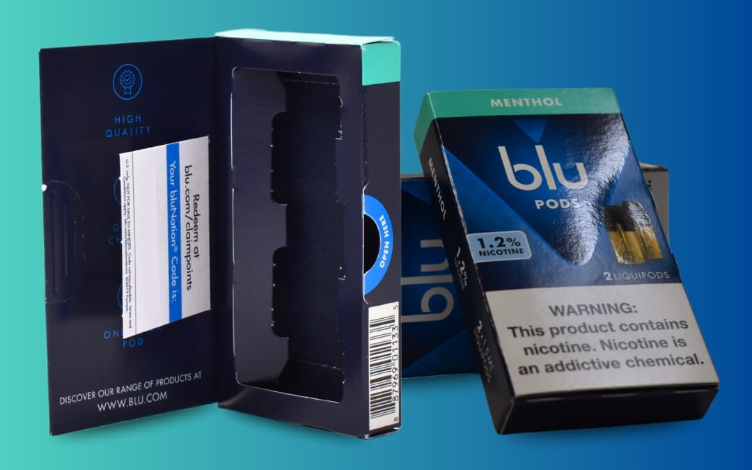
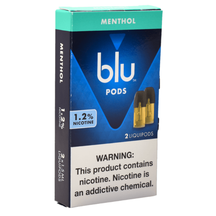
Blu, a leading e-cigarette brand, was facing packaging challenges with their vape cartridge boxes. Their original design featured a tray that held two cartridges and slid into an outer box, accompanied by a loose coupon card inside the box. 

However, this setup presented two issues:

  • Inefficient Pack-Out Process: The use of multiple components in the packaging was causing a slower than ideal pack-out process.
  • Lost Coupon Cards: The loose coupon cards frequently slipped out before the end-user even opened the product.

To complicate matters, any packaging redesign had to comply with strict FDA regulations. Once a product’s packaging is approved by the FDA, any changes to its dimensions or weight require resubmission. Therefore, the redesign had to adhere to these limitations while solving Blu’s challenges.

FEATURES

SERIALIZED CODES

PERFORATED CARDS

INTEGRATED DIVIDERS
The Solution

Wynalda’s Design Team took on the challenge, crafting a solution that enhanced Blu’s packaging efficiency and secured the coupon cards, all while remaining within the FDA’s constraints.

The new design featured:

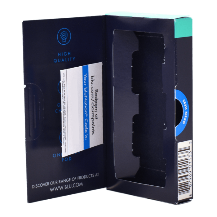
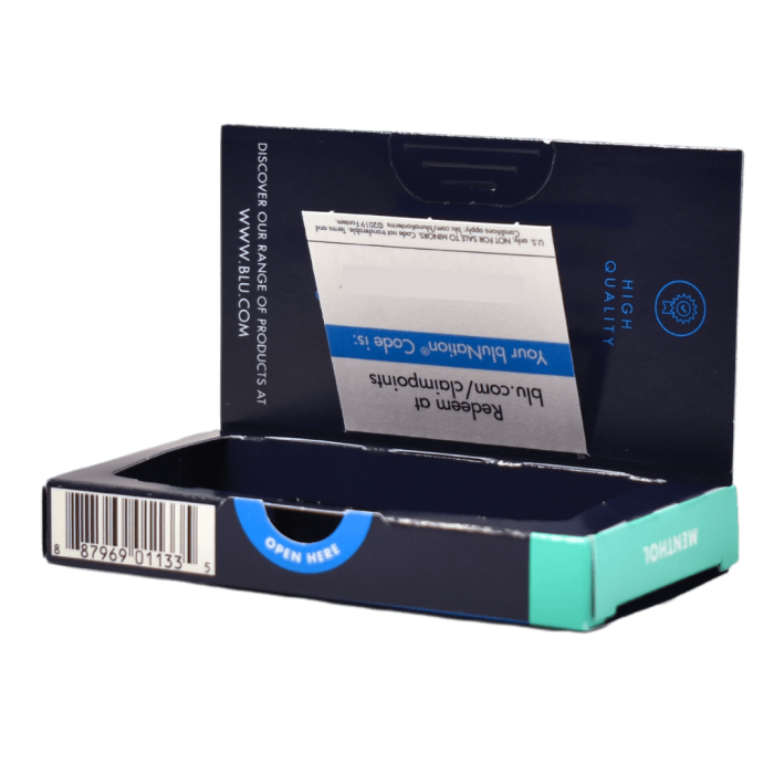
Streamlined Structure: A straight tuck carton with an integrated door panel and dividers replaced the inner tray and outer box. This simplified the packaging process, allowing for quicker and more efficient pack-out.

Coupon Card Integration: To prevent coupon loss, the card was integrated directly into the carton as a perforated section on the inside of the box, ensuring it stayed with the product until opened by the end-user.


The redesign maintained the exact external dimensions, style, and weight of the original packaging, avoiding the need for FDA resubmission. We paid careful attention to ensure that all components, including the integrated panels and coupon card, matched the previous packaging’s specifications.

Additionally, Wynalda’s IT team developed custom software to generate unique, secure coupon codes. This system ensured no duplicates and filtered out any potentially offensive codes. The codes were securely stored and made available for Blu to manage within their system.
The Results

The results of this redesign were transformative for Blu. The new packaging dramatically improved pack-out efficiency, eliminating delays and bottlenecks. The integrated coupon cards stayed securely in place, preserving promotional value and enhancing user experience. 

To top it off, the redesign met all FDA requirements, sparing Blu the time and expense of resubmission. Blu was thrilled with the new packaging, leading to a long-standing partnership with Wynalda, with repeated orders for this successful design.
DNA Collection Kit Packaging for FamilyTreeDNA

DNA Collection Kit Packaging for FamilyTreeDNA

CASE STUDIES


DNA Collection Kit Packaging for FamilyTreeDNA

Project Overview

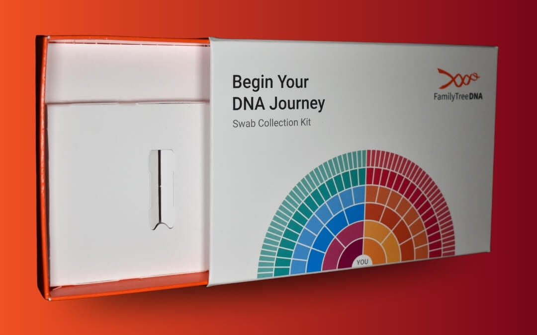
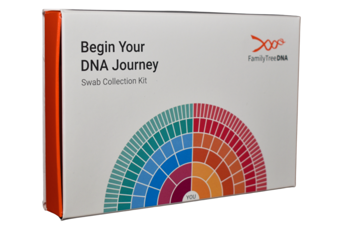
FamilyTreeDNA tasked Wynalda Packaging with designing and producing packaging for a DNA Collection Kit. The packaging needed to protect and hold the kit’s contents securely while presenting a high-quality, professional appearance and seamless unboxing experience.

FEATURES

SUSTAINABILITY

SPECIALTY COATINGS

PAPERBOARD INSERT

Structural Design


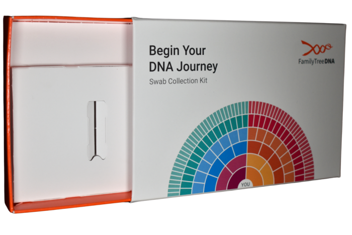
We designed a folding carton package consisting of three elements: a tray, an outer sleeve that slides over the tray, and an insert to hold the product in place inside the tray. We also incorporated a locking mechanism into the tray to stop it from sliding all the way out of the sleeve. All three elements were crafted from 28 pt SBS, providing a clean, white printing surface and sturdy structure and support for the kit’s contents.

Printing & Coating


The sleeve was printed with CMYK plus a custom PMS orange, and the entire tray was printed with that same PMS orange. The insert, as well as the background of the sleeve, was left unprinted, allowing the white stock to show through.

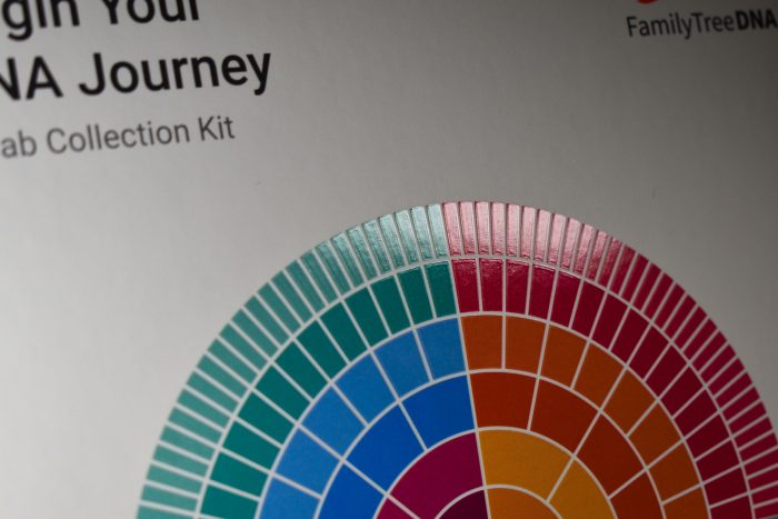
To achieve a premium look and feel, we applied a soft-touch coating on the sleeve with spot gloss UV added to enhance specific design elements. The tray was finished with a flood gloss UV coating, and the insert was finished with a flood soft-touch coating. We used a Cyrel plate to achieve precise spot gloss registration on the intricate details of the design.

Conclusion


The final product was a secure and aesthetically pleasing DNA Collection Kit that provided a premium look and feel. The combination of high-quality materials, specialty coatings, and meticulous printing ensured a professional, refined look that enhanced the unboxing experience and reflected the brand’s dedication to quality.

Rigid Box with Paperboard Insert for EDJY Toenail Cutters

Rigid Box with Paperboard Insert for EDJY Toenail Cutters

CASE STUDIES


Rigid Box with Paperboard Insert for EDJY Toenail Cutters

Project Overview

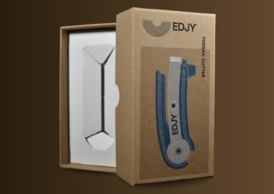
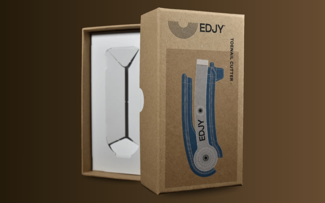
The packaging for the EDJY Toenail Cutter was designed to reflect the product’s focus on quality, functionality, and sustainability. By combining a premium rigid box structure with recycled materials and a minimalist visual design, the finished package delivers an elevated unboxing experience while reinforcing the brand’s eco-conscious positioning.

FEATURES

SUSTAINABILITY

SPECIALTY COATINGS

PAPERBOARD INSERT

Premium Rigid Box Construction


The package features a two-piece telescoping rigid box that provides durability and a high-end presentation. Constructed with recycled chipboard and wrapped with recycled paper, the box offers the strength and protection expected from rigid packaging while incorporating more sustainable materials. To improve usability, the lid includes integrated thumb notches that make opening the package easy and intuitive.

Product Protection & Presentation


Inside the box, a straight-tuck SBS insert with press-in cutouts holds the toenail cutter in place. The insert keeps the product centered and protected during shipping and handling while creating a clean, organized presentation when the package is opened. The simple, unprinted insert design complements the minimalist aesthetic of the overall package while ensuring the product remains the focal point.

Sustainable Material Choices


Sustainability was a key consideration throughout the packaging design. The use of recycled chipboard, kraft paper wrap, and a paperboard insert provide a 100% paper-based solution, while maintaining a premium appearance. The mono-material design helps maximize recyclability and is widely accepted in curbside recycling streams.

Minimalist Printing & Coating


The outer wrap features a minimal design printed using four-color process printing. Since the paperboard wrap is Kraft brown, we also printed two layers of white under the product image to provide brighter, more vibrant colors. Rather than covering the entire wrap with graphics, the design intentionally leaves much of the recycled paper exposed, allowing the natural texture to remain visible. This reinforces the package’s sustainable character and helps reduce overall ink usage.

A soft-touch coating is applied over the entire wrap to protect the printed graphics and provide a premium feel, while preserving the natural look of the paper. 


Results


The finished package successfully balances premium presentation with environmental responsibility. Through thoughtful material selection, minimalist graphics, and functional structural design, the EDJY Toenail Cutter rigid box creates a distinctive unboxing experience that aligns with the brand’s values while providing the protection and shelf appeal expected from a premium product.

Sustainable, Anti-Theft Packaging Redesign for PopSockets

Sustainable, Anti-Theft Packaging Redesign for PopSockets

CASE STUDIES


Sustainable, Anti-Theft Packaging Redesign for PopSockets 

The Challenge

PopSockets needed a new packaging solution for its PopGrips with Swappable Tops. Each package contained two interlocking components—a base and a top—and had to allow shoppers to see and interact with the product while it remained inside the package.

At the time, the product was packaged using a thermoformed plastic insert inside a folding carton. While this design provided a hands-on customer experience, it also created a significant retail challenge: the product could be removed too easily, leading to theft and product loss.

At the same time, PopSockets was working to reduce the environmental impact of its packaging by eliminating plastic components wherever possible.

The challenge was to create a packaging solution that improved security, supported sustainability goals, and still allowed customers to engage with the product before purchase.

FEATURES

COLD FOIL

SPECIALTY COATINGS

EMBOSSING

Structural Design

Wynalda Packaging developed a new structure built around a paperboard retention card that the PopGrip securely screws into. The card is enclosed within a windowed envelope-style folding carton that allows customers to see and touch the product while preventing it from being removed without damaging the package.


Sustainability

The redesigned package was manufactured using 100% recycled paperboard and was fully recyclable and FSC®-certified (FSC® C149826). By replacing the thermoformed plastic insert with a paperboard-based solution, PopSockets was able to eliminate plastic from the package and move closer to its sustainability objectives without sacrificing functionality or shelf appeal.

Printing

The project coincided with a broader brand refresh, requiring exceptional color accuracy across a wide range of SKUs.

Wynalda Packaging produced seven custom spot colors in-house, including five fluorescent inks, to achieve the vibrant appearance PopSockets was looking for. In addition, the packaging program included numerous licensed and co-branded product lines, including collaborations with Coca-Cola, Harry Potter, Vera Bradley, Peanuts, Marvel, Star Wars, and TikTok.

Maintaining consistent color reproduction across multiple brands, graphics, and product variations required careful color management throughout production.


Finishing & Embellishments

To enhance shelf impact, the packaging incorporated several premium finishing techniques.

A reticulating coating combined with spot gloss UV created visual contrast and tactile texture.

Cold foil was applied inline during printing to add metallic effects while maintaining production efficiency.

Select design elements were further enhanced through embossing, adding depth and dimension to the finished package.

Converting & Assembly

The package design required a specialized gluing and assembly process to achieve the desired structure at production speeds.

Custom converting techniques were used to accurately form the package, including a unique gluing sequence that allowed the structure to be assembled efficiently while securely retaining the product. Double-sided tape was incorporated to provide a reliable closure and ensure package integrity throughout distribution and retail handling.


The Results

The redesigned packaging successfully addressed all of PopSockets’ primary objectives: reducing theft, eliminating plastic, and maintaining hands-on product engagement.

The new structure made product removal significantly more difficult without damaging the package, helping reduce theft in retail environments.

Secondary Packaging for Maker’s Mark Wood Finishing City Series

Secondary Packaging for Maker’s Mark Wood Finishing City Series

CASE STUDIES


Secondary Packaging for Maker’s Mark Wood Finishing City Series

Project Overview

ADM partnered with Wynalda Packaging to develop secondary packaging for the Maker’s Mark Wood Finishing City Series — exclusive New York and Sydney editions featuring cask-strength, locally inspired bourbons available only in their respective airports. The packaging was designed to reflect the premium nature of the collection while creating strong shelf presence for travelers seeking a unique, destination-specific offering.

FEATURES

CUSTOM PANTONE COLORS

DULL VARNISH

EMBOSSING

Structure & Materials

The package is constructed from 24pt SBS, featuring an auto-bottom folding carton with a gusset-tuck top and reinforced side walls to provide added strength and durability for the bottle during transportation and retail display.


Printing & Finishing

To maintain consistency with both the bottle design and the Maker’s Mark brand identity, the carton is printed using three Pantone colors: Maker’s Mark signature red, a custom black, and a custom cream background carefully color-matched to the bottle label. To reinforce the natural, wood-inspired aesthetic of the Wood Finishing Series, black graphics were used to create a tree-ring pattern across the top of the box, along with fine fiber detailing throughout the background to emulate the look of textured paper. A dull varnish was applied to enhance the organic appearance and provide a refined matte finish.

Embossing

Selective embossing was added to key text elements on the front panel to create depth, dimension, and a tactile, premium feel that elevates the overall presentation.


Conclusion

This packaging solution combines durable structure, refined print execution, and thoughtful finishing details to support the premium positioning of the Maker’s Mark Wood Finishing City Series. The result is a distinctive retail package that captures the craftsmanship and exclusivity of the collection while delivering a polished consumer experience.